Pre-Assessment
Composition
This week’s video theme was composition, so I chose to give a pre-assessment intended to gather opinions from the students about subject placement in the frame, as well as overall enjoyment of particular images. I projected the photos in front of the class and had them answer the following questions about each one.
- What is your initial judgment of the composition of this photo?
- What is your eye drawn to? (The answer can be multiple things)
- Does anything stand out as uncomfortable in terms of composition? Why do you feel this way?
- Do you have any suggestions for improvement?
Photo #1

Photo #2

Photo #3
Photo #4

Photo #5

Photo #6
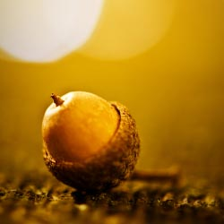
Photo #7

After the initial assessment, we began a discussion about their opinions, as well as the differences between the well/poorly composed images. We spoke about the rule of thirds, as well as the purpose of the lines that appear on their phone screen as they take a picture.

The discussion became very passionate, inciting several disagreements among students.
Findings
The purpose of this pre-assessment was to try and determine if our conventions for composition are ingrained, or simply a learned pattern of thinking. After reviewing their responses for each photo, I was completely unclear. Some kids answered the questions with similar alignment to the orthodox, while others gave very vague responses to each question.
Conventional compositional belief
|
Most common student opinion.
|
Photo #1:
|
Photo #1
|
Photo #2
|
Photo #2
|
Photo #3
|
Photo #3
|
Photo #4
|
Photo #4
|
Photo #5
|
Photo #5
|
Photo #6
|
Photo #6
|
Photo #7
|
Photo #7
|
Reflection
I was surprised at the students’ responses, and how little they cared about subject placement. In fact, many of them preferred the placement of the businessman in Photo #5 than the young girl in Photo #4, whereas I would have expressed the opposite opinion. We began talking about selfies and angle preference and composition. Many of them preferred a high angle of shooting with a centered subject matter, as opposed to the conventional chest-height off-center subject placement.
I was not as surprised at how they felt about Photo #7, even though their opinions contradicted compositional standards. This shot is seen quite often when people try and take picture of the sunset; they frequently mistake cool subject matter for good composition. In this case, since the sunset is often a striking subject, people tend to feel that all sunset pictures are inherently good ones. The kids felt the same way; sunsets are beautiful in real life, so pictures of them will also be beautiful. Fortunately this isn’t true, otherwise no one would travel!
I quite enjoyed this activity, as I had never given a pre-assessment in Video Production before. It was interesting to try and discern which “photographic standards” are built in to our natural appreciation for visual balance, and which are simply adopted. Strangely, after discussing the norms of composition with the kids, many immediately changed their opinions of some of photos. When I described eye movement, they began to appreciate Photo #4, as well as understand the problems with Photo #7.
Next time I’d like to include video clips, to show composition and camera movement. I also might ask them to go out and take “good” pictures, to see how they would frame a shot before learning the norms. Nevertheless, the activity resonated with both students and teacher, hopefully giving some insight to both.
As a science guy, I took a combined course in field geology and photography...the reason being so few pictures are as effective as they should be...the geology was a blast but the photography was life changing...I don't spend a lot of time on photography (and I hate the new "cameras")...but...I know how to take a picture that might just be terrific. The best picture I "never" took was at the Needle in the Needles Highway in the Black Hills...a brilliant, double rainbow in a mountain landscape encapsulating my summer geo class w blue-black heavens...I became nervous as I reached the 42nd picture on a 36 picture roll...no film in the camera
ReplyDeleteExcellent job on this preassessment and blog